Boots
Increasing platform conversion rates by 8% through a better navigation experience.
Brief
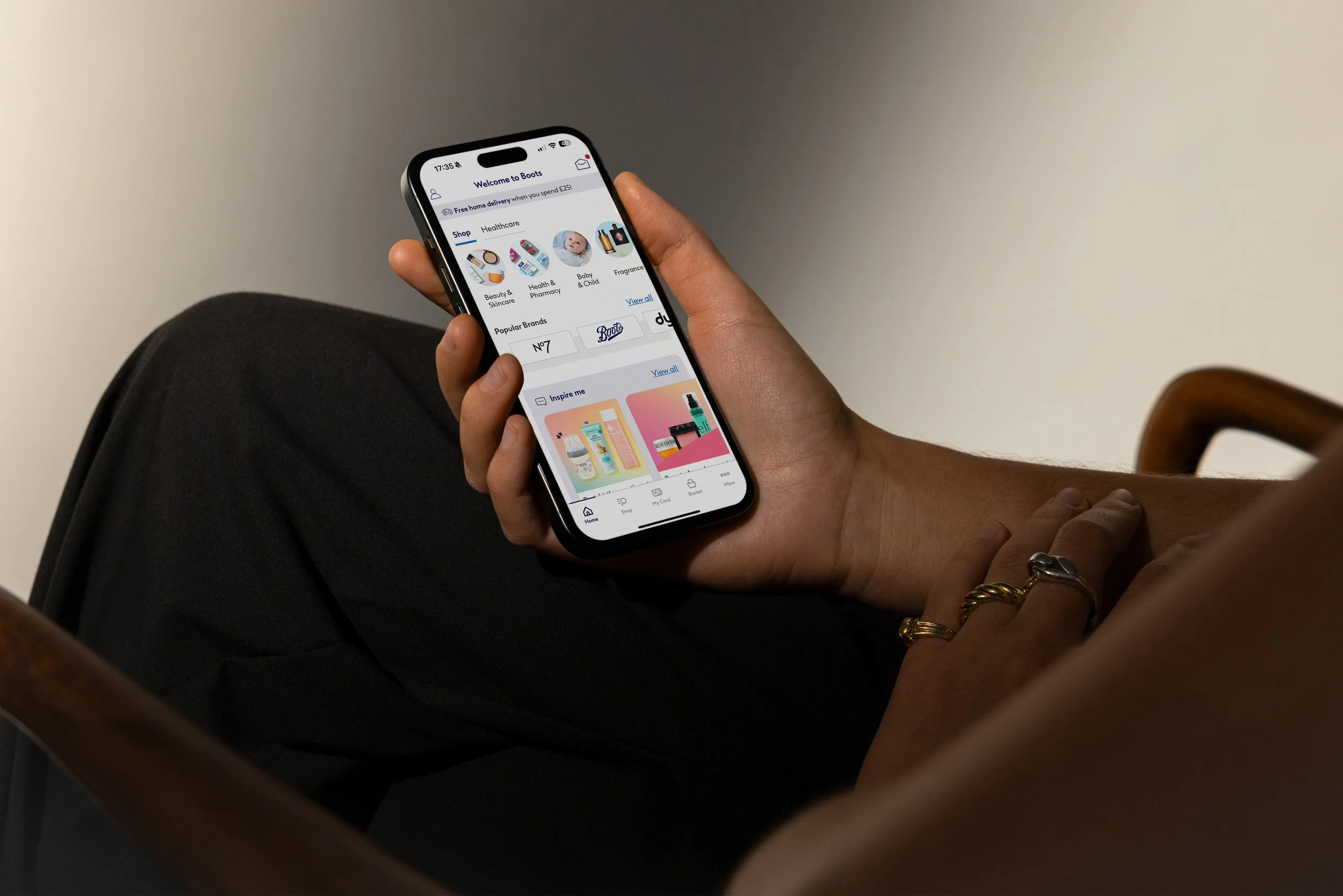
The business aimed to increase sales from the app by transitioning to a native platform. The hypothesis was that this would address customer challenges by making the site more responsive. My first task was to design a bottom navigation component to improve movement between pages, addressing navigation issues identified from customer feedback.
Task
To implement a new global method of navigating the Boots mobile application (while consulting on behalf of IBM).
Hypothesis
By adding a bottom navigation component, we can boost customer satisfaction and improve App Store ratings.
Contribution
Leading the project design, from testing UX iterations to refining the final UI.

AS-IS
The Boots mobile application was a non-native web-app with poor customer feedback due to its unresponsive design and difficult navigation. Only 16% of total sales came from the platform, and it had an average rating of 3.5 stars on the Apple and Google stores.
Customer Pain Points
1.
The app was generally unresponsive and slow to load.
2.
Navigation was difficult, as there was no consistent pattern for moving back and forth throughout the site.
3.
Sections of the platform were non-native, with pages linking to the customers default browser on press. This caused a great deal of confusion as it would interrupt the customers shopping journey by taking them outside of the application with no way to return.
4.
There was a disjointed experience with sections of the app changing between the old and new brand system.
Analysis
My approach was to establish some initial principles; first by completing competitor benchmarking and data analysis I could assume which pages of the application customers would be expecting to access. I created a wireframe prototype which allowed me to demonstrate my thinking to the wider team, whose feedback helped shape the scenarios for further testing.
Competitor Benchmarking
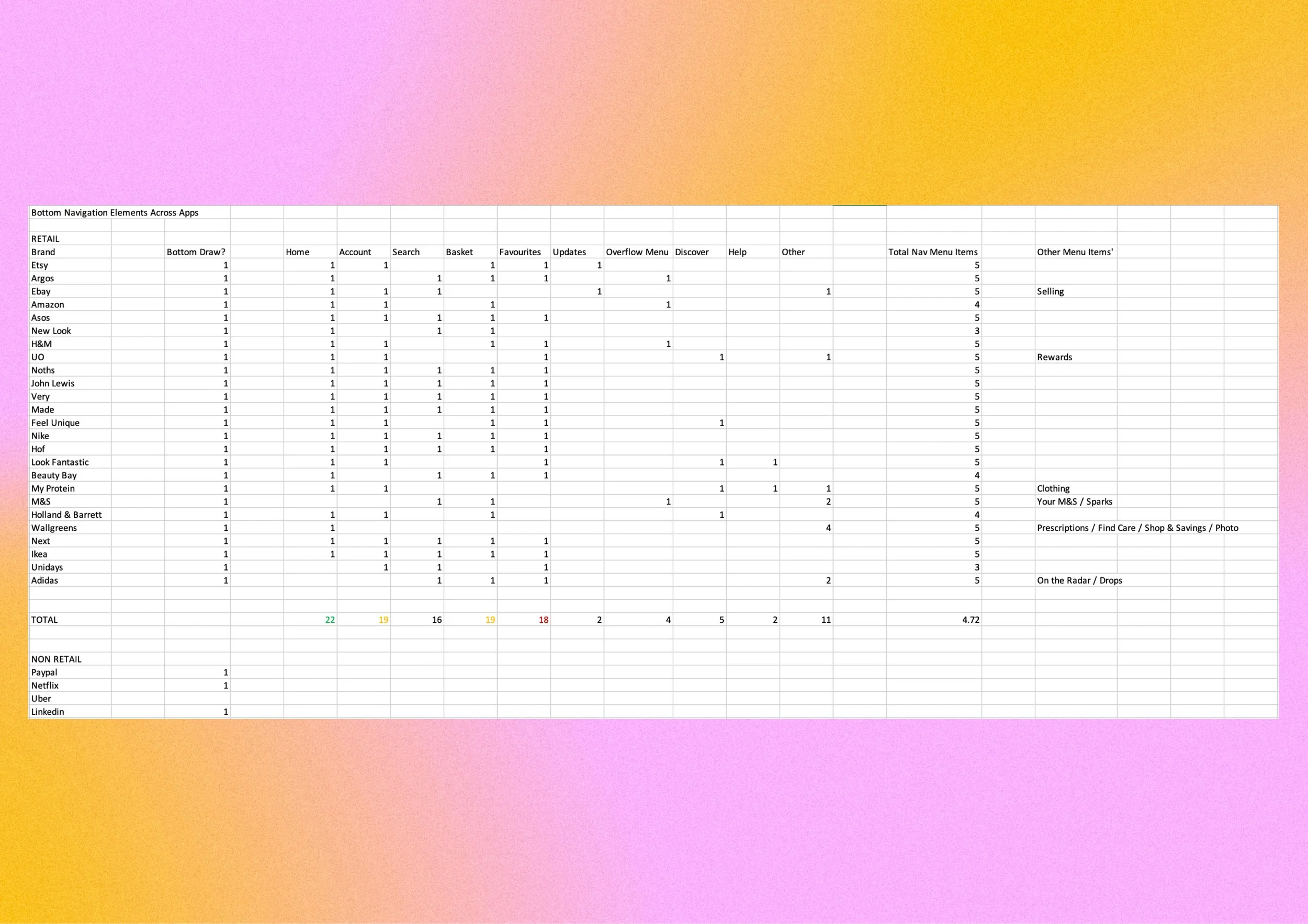
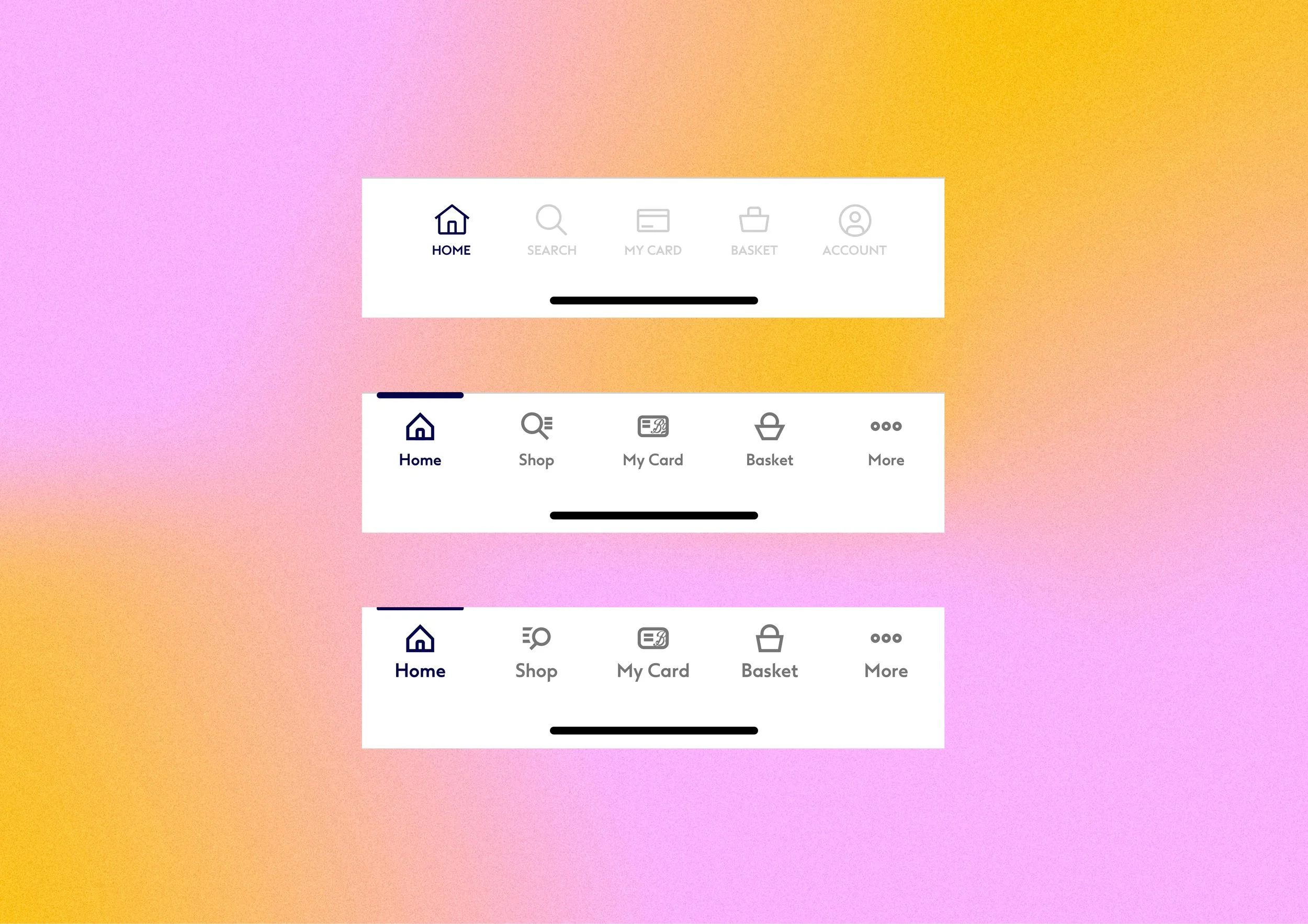
By analysing 27 competitor applications that feature a bottom navigation component, I found that it was typical to include five main sections: Home, Account, Basket, Favourites, and Search.
Total Page Views
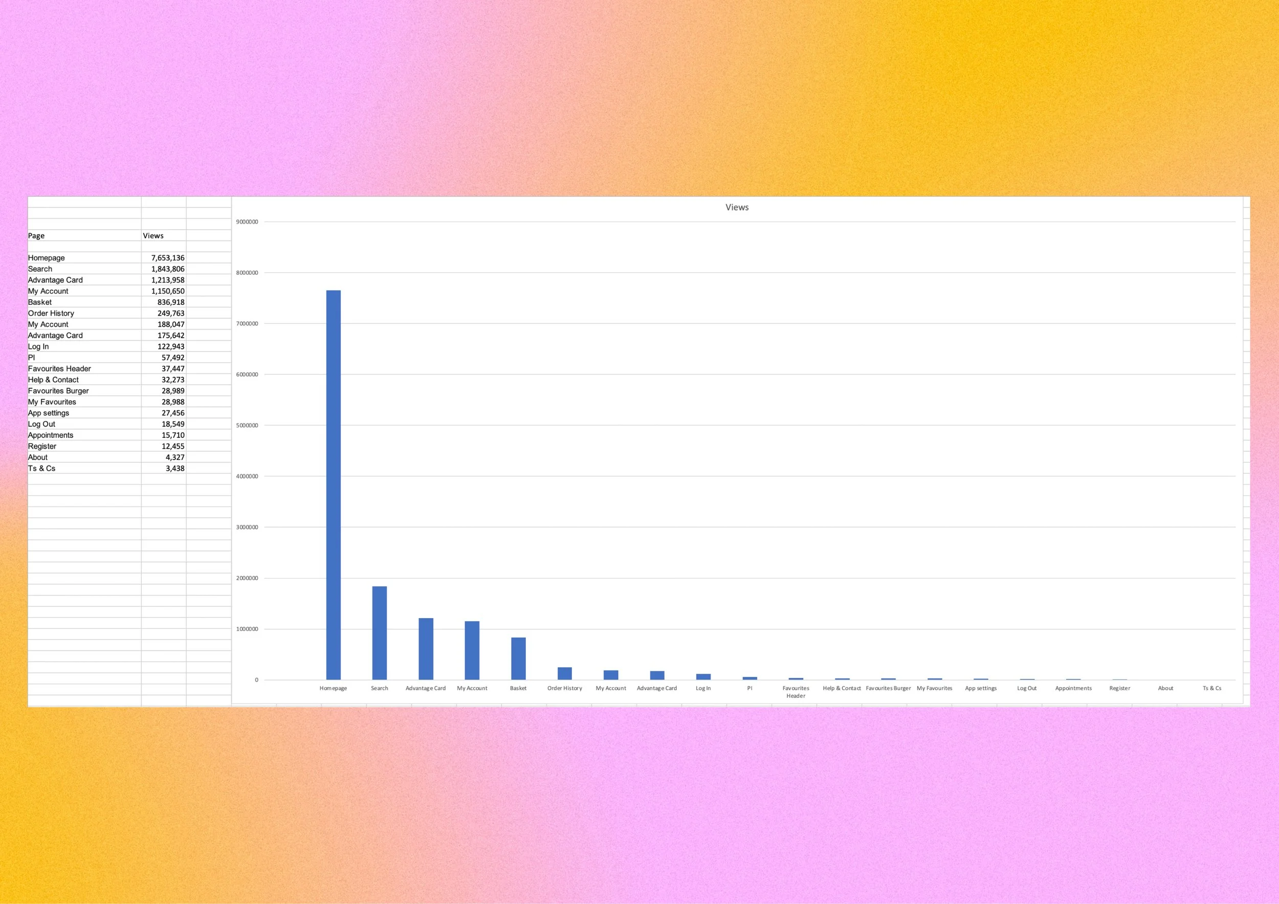
I requested data on total page views for the app, which showed that the Homepage was the most visited section. This aligns with competitor benchmarking where the Homepage was most prominently featured in the bottom navigation, followed by Search, Advantage Card, My Account, and Basket.
Wireframes

I created an initial wireframe design that was hierarchically mapped to the most accessed areas of the site while aligning to the principle of having five sections.
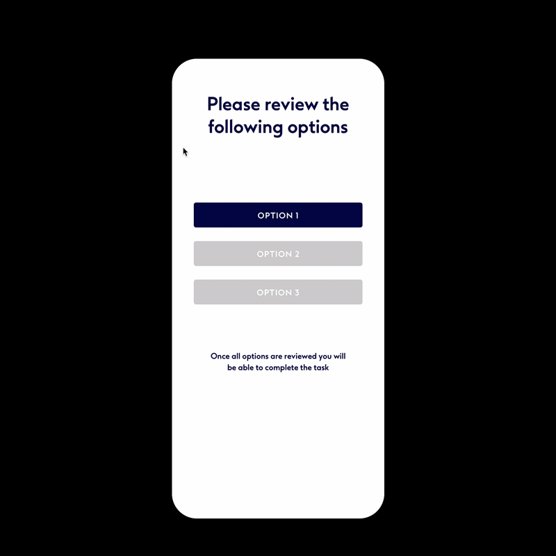
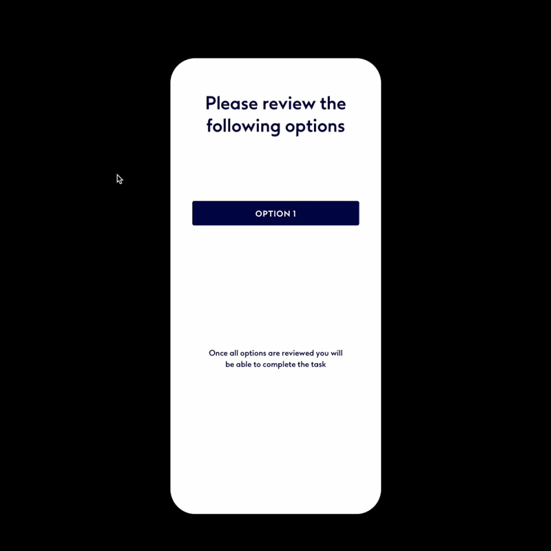
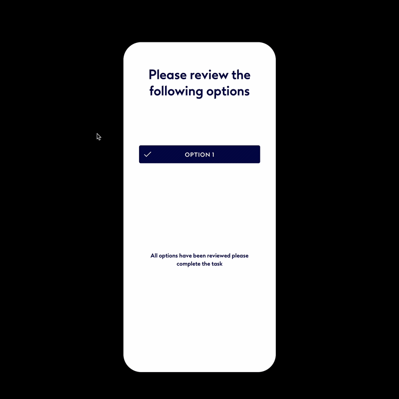
Testing
At this stage I had some key assumptions around the design of the bottom navigation, this included; the correct iconography to represent each section, how clearly the selected states were denoted, and whether the correct sections were mapped and in the correct order. In order to validate my decisions it was decided to run four customer tests, each involving eighteen participants.
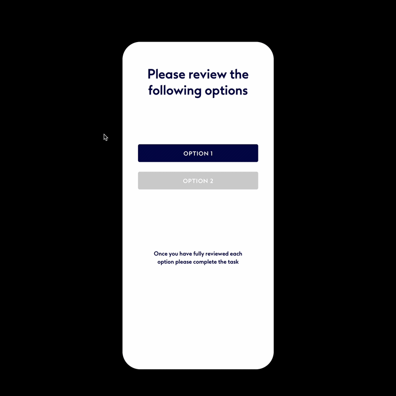
-
Users had two options: one with a bottom navigation design using only icons, and the other with icons and descriptive headers. They were tasked with choosing their preferred design and explaining their choice.
-
Option 2 was unanimously chosen by users, who noted that the added text improved clarity. For instance, many participants initially misunderstood the Offers icon until they saw the version with additional text.
-
Users were given three clickable prototypes: the first highlighted selected menu items by changing the icon color, the second used both a color change and a visible overline, and the third highlighted the selected item with a blocked background color that slightly overlapped the page content. Users were tasked with selecting their preferred design and explaining their choice.
-
The results were evenly split between the second and third options. It was decided to combine elements from both designs to make the selected states clearer and more accessible for users.
-
Participants were shown two navigation bars with different sets of icons. Their task was to identify what each icon represented and to detail where the user would expect to navigate to.
-
The icons with the highest failure rates were for "Home" and "My Offers." I decided to replace the Boots logo for "Home" and refine "My Offers" to use the Advantage Card logo.
-
Users were given an empty navigation bar with five slots and a list of 12 navigation items. They were asked to label the bar with the options they felt were most appropriate.
-
Home
Offers
Search
Basket
Loyalty Card
The most popular navigation item, "My Account," received 10 votes. While it wasn't the top choice for any single slot, it frequently ranked as the second or third favorite.
After testing, key design updates were needed: icons with underlined header text, a navigation hierarchy of /Home/Shop/My Card/Basket/Account, a high-contrast selected state with a highlighted top bar, and using the Advantage Card icon for the "My Offers" section.
UI Refinement
After identifying the best UX principles through testing, I finalized the UI design of the component. I worked closely with the broader brand and app design teams, incorporating their feedback to ensure full compliance. The component was then integrated into the wider Boots design system.
Design progression
The icons were refined and scaled to 32px, 24px, and 16px grids. Initially designed with a 1px stroke, I increased the thickness to 2px based on team feedback, which required additional design adjustments. The 24px icons were selected for the bottom navigation, with a 2px gap around each icon to ensure adequate padding.
Icon refinement
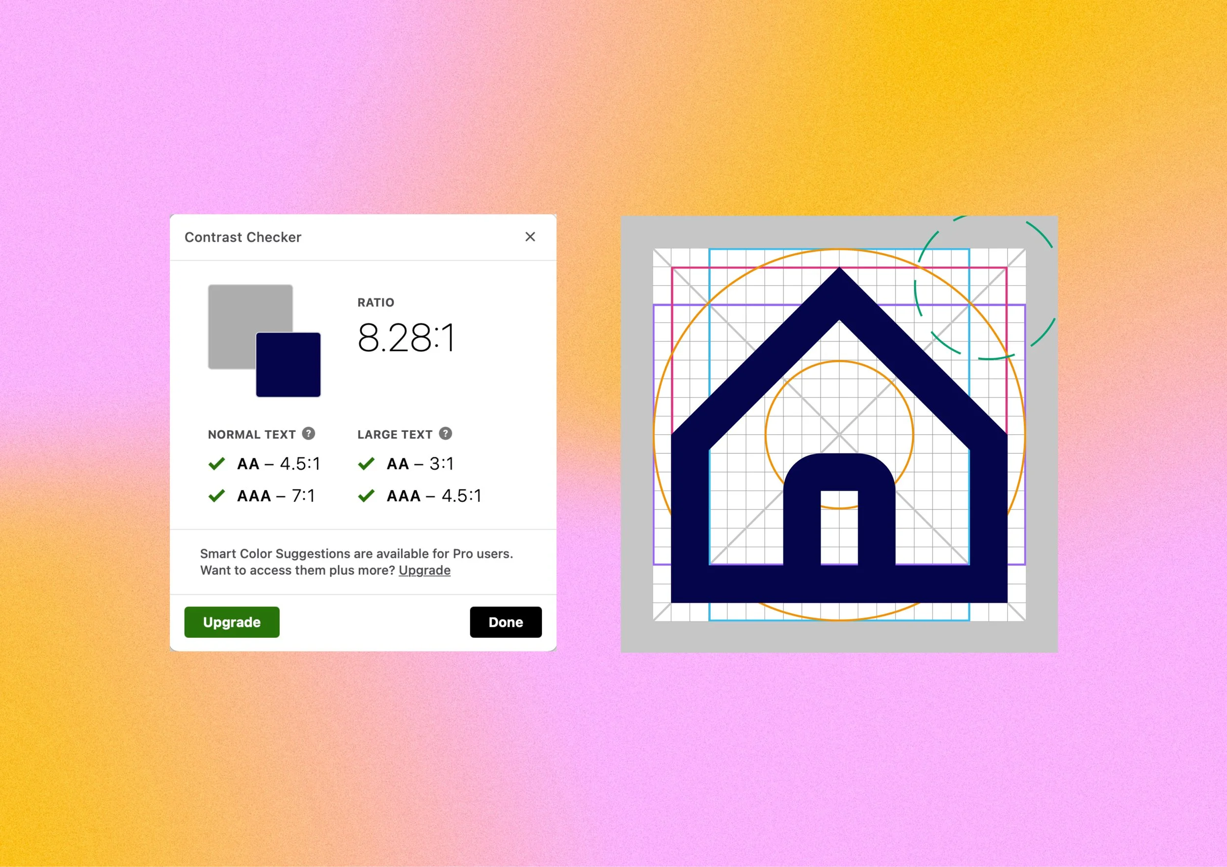
I discovered that the grey used for deselected icons didn't meet contrast requirements with Boots Blue, the brand's official highlight colour. By increasing the lightness of the grey by 18 points, I ensured adequate contrast between selected and deselected states, leading to the removal of the old colour variant from the design system.
Notification patterns
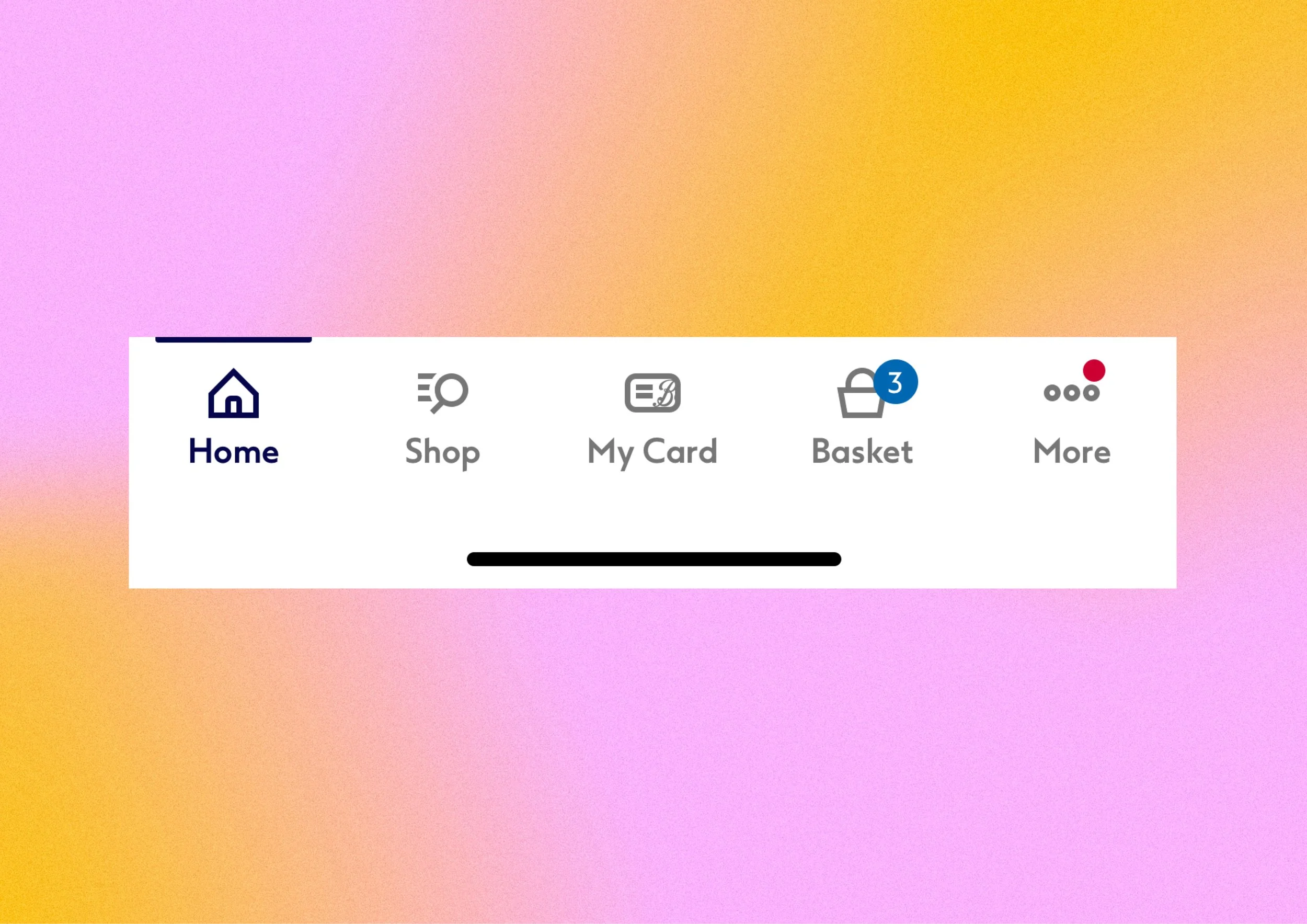
I was tasked with exploring notification patterns, I had considered this by incorporating padding when creating the icons. I utilised the notification red that was in the design system, and approached the team for approval. For the Basket section, I designed a pill icon that adjusts in size to reflect how many items were added to the basket.
Summary
The app was updated with a new navigation component, resulting in an 8% increase in total sales across the platform, bringing the overall sales growth to 24%. Additionally, App Store ratings improved by 1.5 stars. Following these successes, I continued collaborating with the Boots team on various projects, including updating pages to align with the new design system and developing the Price Advantage branding, which was prominently featured in nationwide marketing and advertising campaigns.